Gephi tutorial. Layouts

Colleagues and students often ask me whether it is easy to create a nice graph visualization. My answer is always positive but such conversations often end up where they started for multiple reasons. First, it is hard to understand what people want to do with their visualization. Second, it is hard to summarize everything in one 3-5 minutes step by step explanation. Finally, even if we have managed to resolve first two issues, I still feel like my verbal explanations sound obscure so they feel discouraged and don’t even try. Although, after I show them how to do it, things get much easier. As we all know, it is “better to see something once than to hear about it a hundred times”.
I have decided to create a series of tutorials on Gephi graph visualization. Each tutorial has a short ~3min long walk-through videos. These videos demonstrate that creating interpretable, interactive and nice looking graph data visualizations can be fast and easy. Moreover, it doesn’t require any coding skills, so it can be used by people who just need to get quick insights from their graph-structured data.
I also gave these tutorials after my lecture on data visualization for A Network Tour of Data Science course at EPFL.
This tutorial is about some of the most popular layouts in Gephi. In the next one, I’m going to show how to make your graph visualization interactive and publish it online in a few clicks.
Layouts. Graph attributes. Data exploration
In this tutorial, we will try the most popular tools for graph exploration in Gephi. We will learn how to get visual insights by spatializing and highlighting important attributes of graphs. As an example, we will use a subnetwork of Wikipedia pages that had anomalous visitor activity over the period 15-31 October 2018. You can find the corresponding .gexf in this repository.
Before starting this tutorial, install the following plugins (unless they are already installed in your version of Gephi):
- Multigravity Force Atlas 2
- Circle Pack layout
- Leiden algorithm
- Bridging centrality
- Clustering coefficient
As promised, here is a short step-by-step walk-through screencast to give you an idea of what we are going to do in this tutorial. Also, if you don’t feel like reading the tutorial, just follow the steps in this video. The video reproduces all the steps listed below.
1. Spatialize your graph with force-directed layouts.
To start with, let’s spatialize our graph. To do that, we can use force-directed layouts. They don’t require any attributes and quite easy to setup. We will try four layouts: Multigravity Force Atlas 2, Yuifan Hu, Fruchterman-Reingold, Open Ord. You can find all these layouts in the “Layout” pane. Here are some tips related to the parameters of each algorithm:
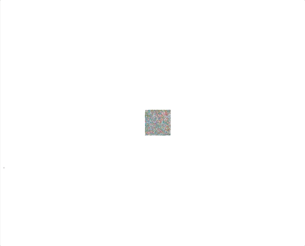
- Multigravity Force Atlas 2
- Scaling. Control scale of the expansion of the graph.
- Dissuade hubs. Apply stronger repulsive forces to hubs.
- Prevent overlap. Prevent nodes from overlapping.
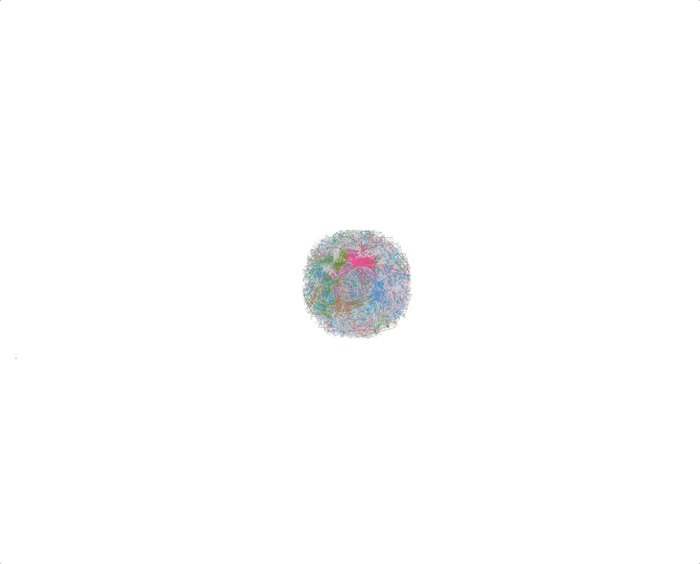
- Yifan Hu
- Step ratio. High ratio improves quality (at the expense of speed)
- Optimal distance. Controls distance between nodes
- Theta. Smaller Theta gives leads to more accurate results (slower)
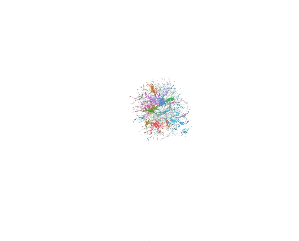
- Fruchterman-Reingold (expensive)
- Gravity. Attraction strength.
- Speed. A tradeoff between speed and accuracy. Higher values lead to faster but less accurate results
- Open Ord
- Edge Cut (0 to 1). Higher values lead to more clustered results.
- Num Iterations. Higher values lead to larger expansion.
In the following examples, colors correspond to modularity.
| Multigravity Force Atlas 2 | Yifan Hu | Fruchterman-Reingold | Open Ord |
|---|---|---|---|
 |
 |
 |
 |
2. Highlight attributes
With Gephi, we can highlight attributes of the nodes using different colors and sizes, reflecting the scale of the attributes. You can do it using “Appearance” pane. Before using the attributes, we should compute them using “Statistics” pane. Some examples of attributes that can be used for sizing and coloring are listed below.
Node and label size
We can use the size to highlight local attributes of nodes.
- Degree. Connectivity of a node
- Centrality
- Betweenness. Number of random walks passing through the node
- Bridging. A measure of bi-partisanship of a node. Nodes that connect multiple communities (serve as bridges) have high bridging centrality
- Page rank. Importance of a node
- Local clustering coefficient. Determines how close are neighbors of a node to a complete graph
Color
Coloring different communities of the graph is a allows to explore the structure of your graph and make it more visually appealing. To do that, we need to run a community detection algorithm. Once you compute communities, you can color the graph using “Appearance” pane.
- Community detection algorithms
- Louvain modularity (Modularity in Gephi)
- Leiden algorithm
3. Use attributed layouts
Gephi also provides a set of attributed layouts. You can use them to spatialize nodes according to their attributes. Here are a few examples of attributed layouts:
- Circular. We can use it to show the distribution of nodes and their links and order nodes by an attribute and draw them on a circle.
- Radial Axis. This layout allows studying homophily by showing distributions of nodes inside groups. Axes radiate from the central circle. The layout groups nodes by an attribute and draw them in axes.
- Network splitter 3D. Use this if you want to unfold the graph in layers based on attributes. However, there is a trick. To use it, you need to copy a column with an attribute of interest and add [Z] in the end of the name of the column. Z-maximum level parameter should be equal to the number of layers you want to get, e.g. number of communities if you use communities as a splitting attribute.
- Circle pack. This layout allows to group nodes by attribute(s) and plotting them in circles.
In the examples below, we use modularity (community ID) as an attribute.
| Circular | Radial Axis | Network splitter 3D | Circle pack |
|---|---|---|---|
 |
 |
 |
 |
4. Enhance readability with spatial transformation layouts
Normally, after all the transformations we have performed, it’s hard to read labels. To enhance readability and interpretability of your graph, use the following layouts.
- Expansion/Contraction. This layout simply changes the scale of the graph.
- Noverlap. Use it to prevent overlapping nodes.
- Label adjust. This layout spatializes labels so that they are easier to read. Before running it, you should display labels.
5. Additional resources
If you want to learn how to publish Gephi graphs online, take a look at this tutorial. For more information, check out official Gephi tutorials:
- Gephi tutorial on layouts.
- Other Gephi tutorials.
Let me know what you think of this article on twitter @mizvladimir or leave a comment below!